Parsing Flash Gordon by Dan Schkade
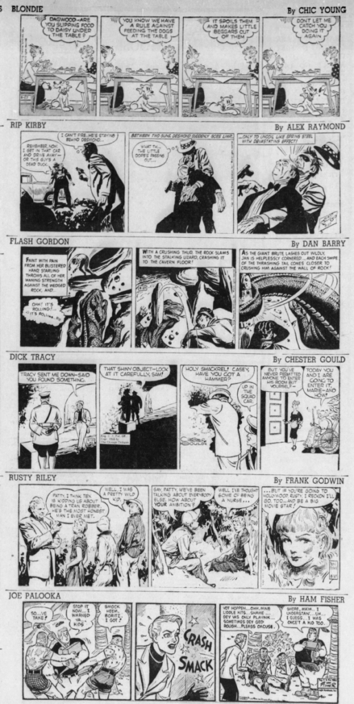
Skip to commentsBack in “the good old days” of the adventurous decade daily comic strips ran, more than less, four panels wide.

World War Two with its material reductions basically ended that and by the 1950s three panels became the norm.

These days two panels seem more common than three for adventure and other continuity strips.


And that brings us to the new for 2023 Flash Gordon comic strip by Dan Schkade. A daily four panel grid:

I’ll guess that Dan, in association with the KFS editors, decided on this so the action and story would be moving at a faster clip than all the other continuity strips (the relatively newish Mark Trail also has four-panel dailies). And it works, the strip has an exciting movie serial feel to it, or an Indiana Jones energy for you kids, with enough plot progression to keep the reader from drifting as we can with those plodding two panel daily story strips. The story itself has been interesting and action-packed without hints to what the future holds and a decent introduction to the background of the nearly ninety-year-old Flash Gordon comic strip for youngsters unaware of this classic.
The four-panel grid also offers newspapers the chance to stack the strip for more placement opportunities.


Or even, if Dan strictly sticks with those four panels, a vertical one column format:


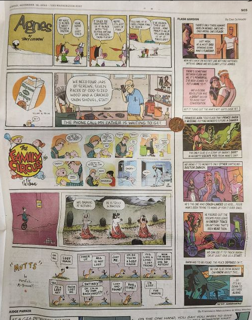
Which could give readers a better (larger) view of Dan’s wonderful modern art and his script. Hey, the coloring ain’t bad either. As The Washington Post (below) shows, the incredible shrinking comic strip of today’s 11 inch wide newspaper pages do not display comic art or words to their best advantage.

Which brings us to Dan’s unique Sunday page recaps. It is unavoidable – present the story without adding new twists so the, usually more, daily newspaper clients and readers aren’t missing out on any plot lines. Schkade has taken to featuring one character summarizing the past week of dailies from their viewpoint.


I can’t think of any comic strip regularly using character narration like this for the Sunday summary. A little glimpse into a character’s thoughts which takes nothing from the daily-only reader. It’s intriguing and fresh.
Also, after the first couple, Dan has settled into a nine-panel grid for the Sunday page (again, like Mark Trail).

Which, again, gives the newspaper the ability to fit the strip into it’s Sunday Funnies in a half-page, third-page, or quarter-page format. Or, as The Washington Post runs it, where it replaced The Amazing Spider-Man, vertically:

As you may have surmised I am happy with Dan Schkade’s Flash Gordon and highly recommend adding it to your Comics Kingdom favorites.


Comments 5
Comments are closed.