CSotD: Sunday, July 4, 1920
Skip to comments
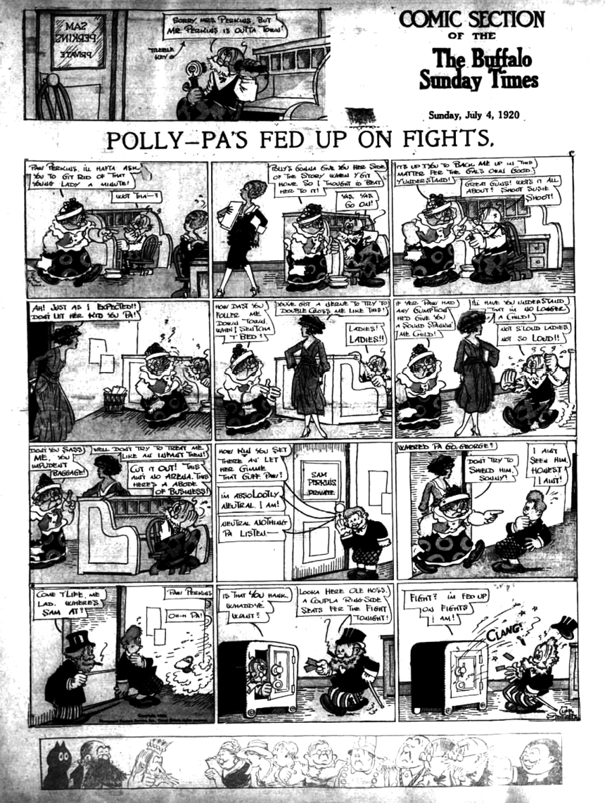
A century ago, July 4 fell on a Sunday, which provides some long-form comics. Oddly enough, it provides only a limited amount of holiday hoopla, and I didn’t find a lot of Independence Day graphics to brighten up the place.
Instead, Page Ones were covering the Democratic Convention, which, as this Boston Globe Extra explains, was deadlocked, and I should explain two things, O Best Beloved.
One is that an “Extra” is just that: Not just important news, but news important enough to fire up the presses for an off-schedule extra edition. Even the West Coast papers had to go to press without the Democrats having made their choice.
The other is that, back in them thar days, conventions were not a coronation but a working session: Party faithful created a platform they could all live with and then found a candidate who could carry it forward.

One thing both parties agreed upon, as this unsigned cartoon says, was to leave Prohibition alone.
An enduring historical myth is that everyone hated the 18th Amendment, which skips over the fact that three-quarters of the states had to endorse it for it to have become law.
There was a substantial portion of “dries” in the country who welcomed an end to drunkenness and, in particular, the domestic violence that came with it, but the “wets” began undermining the amendment from the start and never mind Al Capone: There was a lot of perfectly legal money and muscle behind the “wets.”
But at this stage, Prohibition was too young to have sparked much in the way of controversy. That would come up in 1928 with Al Smith’s run for the White House.

This cartoon, from a Galveston paper, was pushing for William McAdoo, Woodrow Wilson’s son-in-law and a confirmed “Dry,” but he lost on the 44th ballot to James Cox, who promptly got his ass (pun intended) kicked in the general election, 404 to 127, by Warren Harding, who proved one of the worst presidents in our nation’s history, presiding over the Tea Pot Dome scandal, which was only the tip of the corruption that unfolded upon his death.
Interesting times indeed, and it’s kind of comforting at the moment to know that the nation eventually rebounded, though that Making of America Great Again involved the Great Depression and a major World War.
Well, never mind all that; let’s have some comics.
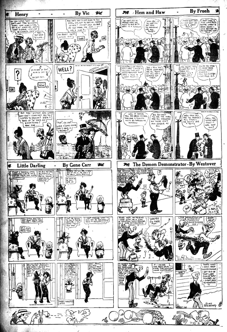
I’d note that, while cartoonists were given a lot of real estate to work with, their ability to craft side-splitting gags was still somewhat in its infancy, and the art here is more impressive than the jokes.
However, it may be that all that space, while it gave them room to develop more complicated storylines, didn’t result in quick, snappy gags. Much more Myron Cohen than Henny Youngman style.
Also, they needed some help coming up with better titles.
Picky-picky-picky. Let’s dig the artwork and quite kvetching.

This piece, which ran in the Globe, seems as if the artist took a Punch cartoon and stretched it out into a sequential format. At a time when Clare Briggs, Rube Goldberg and others were doing light observational domestic humor, it seems like a throwback.
Briggs also had a Sunday strip:

As did Goldberg:


This piece is unsigned but has a familiar feel: Nostalgic strips — much gentler than Hogan’s Alley — with lots going on were a popular format and, while some were just here and gone, several became classics.
BTW, Fresh Air kids were nothing new in 1920; the program had been around since 1877 and is still around, getting kids away from the smog and, as the little fellow says here, the cops.

There were also some art pieces that commented on society without going for gags so much as atmosphere, like this Lou Hanlon piece.

While Harry Westerman combines art with more out-front comedy.
And here’s a pair that requires a little background:


Rudolph Dirks had created the Katzenjammer Kids for Hearst, but got into a quarrel there and left in 1914, whereupon they hired another artist. But Dirks signed on with Pulitzer and kept doing the strip, which brought about a lawsuit settled by insisting he find another name for his strip.
The most astonishing part of the story being that the two strips continued to battle it out until 1979.
This is going to be a long entry and so I’ll stop yapping and just let you enjoy the comics.


Yeah, I know. If the strip were still around, Lottie’d be going the way of Aunt Jemima.


“Polly and Her Pals” is a classic that inspired a lot of other “pretty girl” strips like Blondie, Tillie the Toiler and Fritzi Ritz.


Written a few years later, but wotthehell
Gotta get George Washington in here somehow today, and a 1927 song covered by The Jim Kweskin Jug Band in 1963 is certainly not to be despised.
Comments 6
Comments are closed.