Classics Cartooned
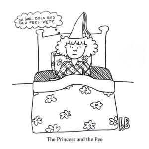
Skip to commentsForget Classics Illustrated, let’s read Classics Cartooned.
I’m Katie, and I’ve been drawing single-panel cartoons for the past eight years.
I love silly puns, drawing, and reading, and these cartoons are a celebration of great books, authors, and literary tropes.
I draw these with felt pens on paper, and then, because I am a bit technologically inept, take a photo and adjust the color on the computer.
Bored Panda presents a gallery of Katie Brookoff book-inspired puns.
Elsewhere a Spoiler Alert…
Cartoonist John Atkinson of Wrong Hands has a playful way of describing some of literature’s most celebrated works. Known for his Abridged Classics series, he shares humorous “spoilers” of novels including The Catcher in the Rye and 1984. His very brief reports of the books are pared down to their most basic and boast a biting, dry wit. Of George Orwell’s 1984, for instance, Atkinson sums it up with the following: “Vision of a dystopian future (now called Tuesday).”
My Modern Met showcases some John Atkinson spoilers.
The New York Times has turned its back on single panels, so they review graphic novels.
The form of comics is often associated with the practice of adaptation — from the big-budget, inescapable, explosion-filled, enormous-scale superhero films that have dominated the box office in the last decade to the enduring tradition of Classics Illustrated, which gave the world the comics version of “Moby-Dick.” A publishing venture that began in 1941 to offer shorter, comics-form adaptations of famous literary works, Classics Illustrated helped cement the belief that comics were easier renderings of a harder, worthier thing.
These are Classics Illustrated comics in fact if not in name.


Comments 1
Comments are closed.