Prince Valiant Receives Title (Panel, that is)
Skip to commentsSomething had to be done.
Eighty years ago it was pretty straightforward. Prince Valiant, in the Days of Hal Foster, was drawn and published as a full broadsheet page. Sure, there might have been some slicing and dicing, some pushing and squeezing to get it to fit as a full tabloid page. But more than less, what was drawn was what you got.
Jump ahead forty years and Hal Foster is handing Prince Valiant over to John Cullen Murphy. By that time another change had already occurred. The full page broadsheet version had disappeared, the half-page format was ubiquitous. With some newspapers still printing it as a full tab the feature had to be laid out so it could be could be printed in two versions. A bit of a pain, but manageable.
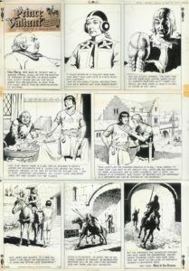
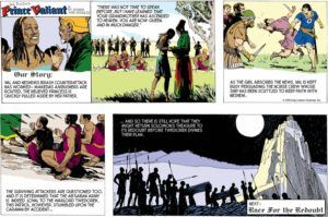
A 1967 Foster page – move the fourth panel up and the fifth panel down to make a two tier half-page.
That eight panel layout (above) became the standard for Prince Valiant in the early 1950s, and with a little manipulating it still allowed for those big beautiful panels.
It must be noted that Prince Valiant was never set up, like many (most?) strips of the time, with a drop panel to convert it from half-page to full tab. Nor did it have a three tier system where the top row could be sliced off with little effect. That last would soon prove to be problematic.
Time passes into a new century and J. C. Murphy passes the strip on to Gary Gianni. And newspapers are squeezing as many comics as they can into their Sunday funny pages, a half-page Prince Valiant is a luxury. One or two clients might have been ignored, but when major clients like the Gannett Sunday Comics Section, which distributes Prince Valiant to scores of newspapers, wants the change…a change is gonna come.
above: the 2007 and 2017 (and current) flags of The Standard Gannett Sunday Comics Section.
So, by the time Gianni takes over the strip it is being seen in three formats: the full tab. the half-page, and the third-page.
So how does King Features accommodate these new demands on a comic strip not suited to conform? They push and shove and distort the layout. It became obligatory for the art of middle panels of the strip to not take up all the space, with text below the art.
That allowed for those two panels to be blown half again larger and the text moved to the side, stretching the comic. The effect created a third-page strip from the half-page strip.
But it perverted the layout and the art. Now when drawing the strip this new aspect had to be taken into consideration. How to make the art functional and pleasing and not too distorted.
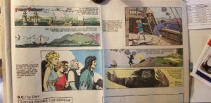
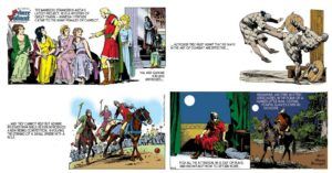
Above: a brilliant Gianni laid out and drawn strip under the restrictions.
Below: Gianni moves from long shots to mid range to a close-up of Aleta. When blown up for the third-page format Val would be about the same size as Aleta.
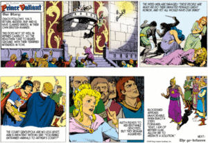
It got a little weird if there was only a line of text for the expandable panels – it would leave a lot of white space in the strip. (below: Flash Gordon visits Prince Valiant and introduces polo to the world.)
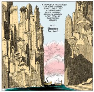
Remember those beautiful big panels? Here’s a half page/full tab panel (hat tip Jim Keefe):
Here it is as a third-page:
To fill the space the text was put on a banner outside the panel.
Ungainly, but what’s a syndicate and artist to do?
This is the situation Thomas Yeates signed into when he took over from Gianni.
Thomas Yeates tells it much more concisely than I:
At some point, lost in the mists of time, a strange design was decreed onto the Prince Valiant Sunday strip. The strip runs in different formats in different papers. And as is usual the two middle panels must be the same size so the page can be adapted to these various formats. That is all more or less normal.
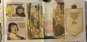
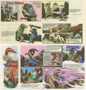
Here’s the strange part. When I took over Prince Valiant I was told that the 2 middle panels needed to have the bottom third empty of art, with the captions in that area, so the page could be reconfigured in a specific way. The 2 middle panels were then digitally enlarged and their captions were moved to the side to stand alone in an awkwardly empty space, see below. This is how I saw it in my local paper when Gary Gianni drew it. Plus the art was squeezed to fit the space, also very annoying. This format continued until 3/2/14, Val number 4021. When I originally got the strip, my first one appearing April 1st 2012, I didn’t want to make waves, it’s a dream job for me. However that weird layout and the squeezing was very frustrating. So rather than complain and ask King Features to do something about it I decided to tackle the problem myself, after all I was the one bothered by it. After two years of Drawing Val I came up with a solution, the good old title panel, like Val’s Viking friend Hagar has, as well as many other strips. By making the title panel the right size we were able to eliminate the big empty space with the awkward caption floating in it as well as the art being squeezed. See second strip below.
Love those little victories.
Something had to be done, so Thomas Yeates did it!
The titles panels, yes plural, are only available in your local newspaper.
Part Two: The Complete Prince Valiant Title Panels by Thomas Yeates
Comments 3
Comments are closed.